The biggest mistakes in design

Mistake no. 1
Make wrong layouts
always remember when you working with text you need to be as accurate as you can, so the user will be on focus on what he reads and feel clean flow when reading.

Mistake no. 2
Make wrong layouts
always remember when you working with text you need to be as accurate as you can, so the user will be on focus on what he reads and feel clean flow when reading.

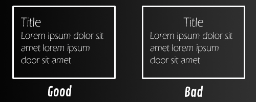
when aligning text to left, keep the title aligned to left also, it’s an important example many designers get wrong.